
Introducing the CoVaxxy dashboard
By David Axelrod (first published on Misinfocon.com)
The last year has been distinguished by two global challenges: the COVID-19 pandemic has killed millions of people and millions more have been exposed to misinformation and disinformation campaigns around a variety of topics of global importance. Among the topics affected by misinformation and disinformation are COVID-19 vaccines. For example, misinformation and data transparency issues pertaining to the AstraZeneca vaccine have destabilized confidence in vaccines and hampered vaccine rollouts in numerous countries. This is troubling given that vaccines are critical in our fight to end the COVID-19 pandemic. Vaccine hesitancy trends have contributed to an emerging view that herd immunity may not be possible.
There has also been greater social mobilization against vaccination efforts. While the antivaxx movement is not new and has been on the rise in the U.S. for two decades, there is evidence (see here and here) linking certain social media activity and vaccine hesitancy. Studies show that misinformation spread on social networks is linked to poor compliance with public health guidance on COVID-19.
The CoVaxxy dashboard, created by Indiana University’s Observatory on Social Media (OSoMe) in collaboration with colleagues from Milan Polytechnic University in Italy, is a tool designed to help the public investigate the troubling links between misleading vaccine information on social media and public health outcomes. The dashboard utilizes a stream of geolocated tweets discussing COVID-19 vaccines in addition to vaccine acceptance and hesitancy survey data from Carnegie Mellon University’s Delphi Epidata API and Center for Disease Control and Prevention (CDC) COVID-19 data as compiled by Our World in Data. Misinformation and low-credibility tweets are identified at the source level using the Iffy+ list. The sources in the list, identified by major fact-checking and journalism organizations, regularly publish mis/disinformation.
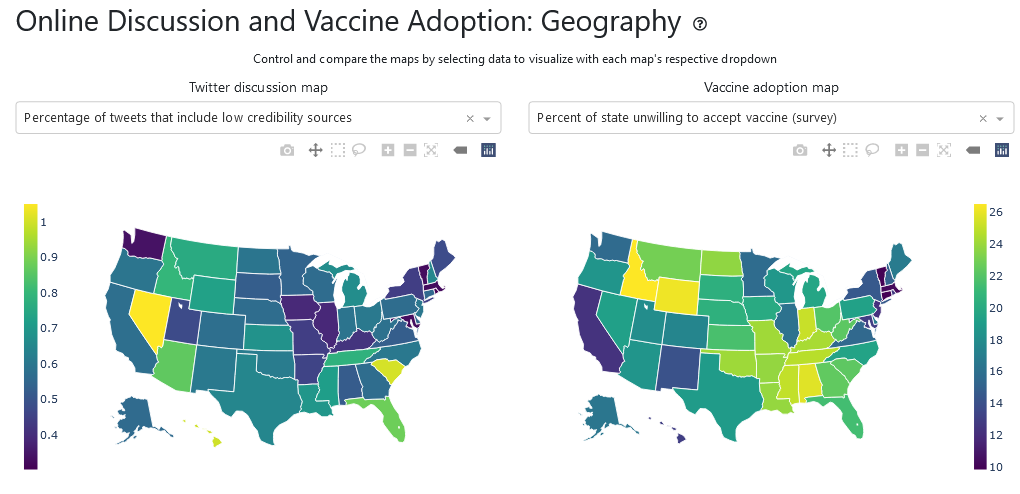
One of the features offered by the dashboard lets visitors visualize the state-level prominence of Twitter vaccine misinformation on maps alongside public health outcomes and attitudes.

Users can further visualize correlations between misinformation and outcomes with various plotting options. Hovering over the plots displays additional data and graphs for users to explore. This includes state-level trends of vaccine hesitancy and low-credibility information geolocated for that state. The visualizations can be customized and downloaded. The data is also available for researchers to download.

Users can explore popularity trends of vaccine-related narratives and sources by selecting hashtags or websites of interest. A bar plot displays the weekly count of low-credibility and mainstream sources. The share counts of the most popular sources, as displayed on April 9th, are shown below. As one can see, low-credibility sources can outperform reliable sources such as the World Health Organization.

If we are to effectively tackle the issues surrounding the COVID-19 pandemic and the misinformation infodemic, open access to key data is necessary. Thus far, our dashboard has been visited by more than 2k people from more than 30 countries and our data has been downloaded nearly 3k times. We welcome additional researchers, journalists, and the general public to also visit the dashboard and help shed light on these important and complex issues.